- Home
- Needlepoint
- Needlepoint Fibers
STUDENT GALLERY & FIBRE GUIDE
How Thread Choice Transforms Needlepoint Texture
The same chart. The same stitches. Completely different results — because of the thread.
It Starts with the Thread in Your Hand
One of the things I loved most about running my needlepoint workshops was the moment — usually mid-morning — when someone would glance across the table and say, “Wait, we’re stitching the same chart?”
Every student started with the same printed design. The same stitch instructions. The same canvas count. But because each person chose different threads, different colours, different fibre types — by lunchtime the table looked like an exhibition of completely unrelated pieces.
That’s the quiet magic of thread choice in textured needlepoint. The stitches create the structure — the peaks and valleys, the crosses and knots. But the thread decides what those structures do. A shiny rayon catches light where a matte cotton absorbs it. A chunky wool fills space where a fine silk leaves gaps. An over-dyed thread shifts colour across each stitch while a solid thread keeps things calm and consistent.
This page is what I wish I could hand every stitcher who asks, “But which thread should I use?” Instead of a list of rules, it’s a gallery of real choices made by real people — my workshop students — and what happened when they trusted their instincts with thread.
You’ll see the same designs stitched in completely different ways. I’ll explain why each thread creates the effect it does, so you can make your own choices with a bit more confidence. And if you’re still not sure? That’s fine. At 3.6 inches square, these designs are built for experimenting.
A quick note about the photos: some of these were taken in workshop conditions rather than a photography studio, so the image quality varies. But the thread effects are real and visible — and that’s what matters here.
What Each Thread Type Brings to Your Stitching
You don’t need to memorise this. Think of it as a quick reference — something to glance at when you’re standing in front of the thread rack wondering what on earth is the difference? These are the fibre types you’ll see in the student gallery below, and the ones most useful for textured needlepoint.
🌾 Cotton
Your reliable workhorse. Matte finish, even coverage, clean stitch definition. Comes as stranded floss (divisible — you peel off the number of strands you need) or pérlé cotton (tightly twisted, non-divisible, lovely rounded texture). Most beginners start here, and many experienced stitchers never leave.
✨ Rayon
High-sheen, light-catching, and unapologetically glamorous. Rayon is a manufactured fibre with the drape of silk at a fraction of the cost. It’s slippery to stitch with — shorter lengths help — but the shimmer it gives textured stitches is gorgeous. More about stitching with rayon →
🌿 Linen
Spun from flax, with a subtle texture and a slightly uneven twist that adds character to every stitch. Beautiful in flat stitches where you want a natural, organic look. Not as smooth as cotton, and that’s part of its charm.
🧲 Wool
Soft, full coverage, warm matte finish. Traditional for needlepoint canvas and still the gold standard when you want stitches to look plump and well-fed. Tapestry wool and crewel wool are the types you’ll see most often.
🧶 Silk
Lustrous, strong, and beautiful. A natural protein fibre with a sheen that’s subtler than rayon — more glow than glitter. Luxurious to stitch with, pricey to buy, and worth it for special projects or accent areas.
⭐ Metallic
Reflective thread that adds sparkle and definition. Best used sparingly as an accent — a metallic border around a matte centre, for instance, or a single row of metallic running through a design. A little goes a long way.
🎨 Over-dyed & Hand-dyed Threads
These are threads dyed with colour that shifts along their length — from dark to light, or between related hues. The magic is that different stitches pool the colour differently. A long diagonal stitch might show a gentle gradient; a small cross stitch might land on a single colour. The thread does half the design work for you. You’ll see a lot of these in the gallery below — most of my workshop students used Oliver Twists One Offs, which come in co-ordinated colour hanks of mixed fibre types. See the thread guide on the patterns page →
A Note on Thread Construction
Threads come in different constructions — stranded floss (divisible into individual strands), pérlé (twisted, non-divisible), and yarn (thicker, often wool). The number of plies you use affects coverage: more plies fill the canvas more fully, fewer plies leave a lighter, more delicate effect. If you’re not sure, stitch a small test area first. It takes two minutes and saves hours of doubt.
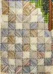
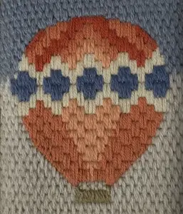
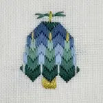
Infinity — Three Threads, Three Worlds
Infinity was the design most students chose first. It combines Scotch stitch borders with cross stitch rows and a central Rhodes stitch — a satisfying mix of textures that builds quickly and responds beautifully to thread choice.
These three pieces were all started in the same workshop, on the same morning, using Oliver Twists One Offs thread hanks. By the afternoon, three completely different pieces were emerging. Same chart, same stitches — the thread made all the difference.
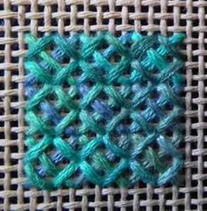
Anne — Sheen Against Matte
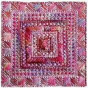
Anne alternated shiny rayon with matte cotton in her Scotch stitch borders, and the result is quietly luxurious. This works because of how the two fibres interact with light: rayon catches it and bounces it back, while cotton absorbs it. Placed side by side in the same stitch pattern, they create a contrast you can see and feel — even from across the room.
The Scotch stitch is particularly good at showing this off. Each block of diagonal stitches acts like a tiny reflective surface, so the rayon blocks almost seem to glow next to the cotton blocks. If you want to try this yourself, you don’t need to buy separate threads — an over-dyed hank that mixes rayon and cotton will do it automatically.
Alison — Heavy Meets Light
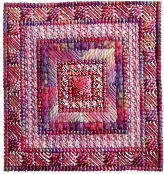
Alison made a different kind of contrast — not sheen, but weight. She chose a chunky thread for the wider cross stitch rows and a more delicate cotton for the Smyrna stitches. The effect is a frame-within-a-frame: the heavier thread advances visually, seeming to sit on top of the surface, while the lighter thread recedes.
This is one of those discoveries that feels obvious once you see it, but it’s not something most of us think about in advance. Thread weight creates depth. A thick thread in a textured stitch looks raised and bold; a fine thread in the same stitch looks delicate and airy. Alison used that difference to give her piece real dimension.
Margaret — Metallic as Punctuation
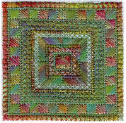
Margaret’s piece is a masterclass in using metallic thread as an accent rather than a feature. Her green and autumnal tones create a rich, earthy feel, and the metallic thread on the borders adds just enough sparkle to create definition — like a gilt frame around a painting.
She also varied the density of her border by using a finer cotton in places, which thins the outer frame and makes the centre stand out more. This is subtle but effective: when the border is slightly less dense, your eye is drawn inward. The metallic catches the light at the edges, and the matte centre holds your gaze. It’s a sophisticated piece, and Margaret didn’t plan it that way — she chose threads she liked and the design responded.
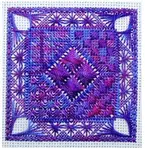
Tranquility — Same Chart, Different Mood
Tranquility uses gobelin, cross stitch, and a central Rhodes stitch to create a design that feels calm and balanced. When students brought their finished pieces to follow-on workshops, even they were amazed at how different the same chart could look. Thread choice didn’t just change the colour — it changed the mood.
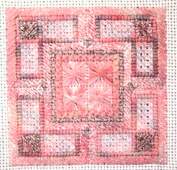
The Pink Version — Light-Catching Gobelin
This is what happens when you put a shiny thread in a slanted stitch. Gobelin stitches lie at an angle on the canvas, and when they’re worked in a light-reflective thread — rayon or silk — every single stitch catches a slightly different angle of light. The effect is almost liquid, like sunlight on water.
The matte border around the outside frames the shiny centre beautifully. It’s the same principle as Anne’s Infinity — sheen against matte creates contrast — but here it’s doing something different. Instead of creating a pattern of light and dark, it’s creating a focal point. Your eye goes straight to the glowing centre.
The Knot Garden — Thin Thread, Delicate Effect
This version uses thinner thread and paler tones, and the result is something that looks like a traditional knot garden with miniature flower beds. The rectangular areas stand out because of the density difference — where the thread covers more canvas, the colour is stronger; where it covers less, you get a lighter, more delicate effect.
This is worth remembering: thread coverage isn’t just about whether the canvas shows through. It changes the visual weight of each section. A fully covered area reads as solid and grounded. A lightly covered area reads as airy and open. This stitcher used that difference — intentionally or not — to create a piece that has real spatial depth.
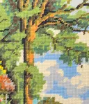
Jean — The Wheat Field
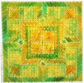
When Jean held this piece up in the follow-on workshop, someone immediately said, “It looks like sheaves of wheat.” And it does. The golden tones with matte greens create a completely different emotional response from the pink version — warm where that was cool, earthy where that was delicate.
The matte greens do something important here: they create visual stability. Green is a grounding colour, and matte thread absorbs light rather than bouncing it. So the green areas feel solid and settled, while the golden shiny thread creates movement and warmth. It’s the interplay between the two that gives this piece its character — neither would be as effective alone.
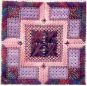
Hope — Nine Stitches, Infinite Possibilities
Hope is the most complex design in the collection — nine different stitches, including Rhodes hearts, Smyrna crosses, and a central Rhodes stitch. It responds dramatically to thread choice because there are so many different textures competing for attention. What you choose to emphasise (and what you choose to quieten) changes the whole piece.
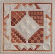
Mine & Erica’s — Same Stitches, Different Focal Points
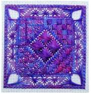
My version (left) uses over-dyed Oliver Twists in purples and mauves, with shiny rayon for the Rhodes hearts. The rayon catches light on the raised heart stitches, drawing your eye straight to the centre of the piece. The over-dyed thread shifts colour across each stitch, adding depth and movement without any extra effort on my part — the thread did the work.
Erica took a completely different approach. Her cream and brown palette is monochromatic — mostly plain threads with multi-coloured thread used selectively for contrast. Where my version pulls your eye inward, Erica’s highlights the corners. The multi-coloured accents in the outer stitches create points of interest around the edges, while the calm centre recedes.
Same nine stitches, same layout, same chart — completely different focal points. And that’s created entirely by thread choice. I chose drama in the centre. Erica chose interest at the edges. Neither of us was “right” — we just made different decisions, and the design responded to both.
The lesson from every single one of these examples? There’s no wrong answer. The thread you choose won’t ruin the design — it will make it yours. Every student who walked into my workshop worried they’d “choose wrong.” Every student walked out with something beautiful that no one else could have made.
Choosing Threads for Your Own Project
If you’ve read this far and you’re thinking “but how do I actually choose?” — here’s the honest answer: there’s no formula. But there are a few things I’ve seen work consistently, from years of watching students navigate this exact question.
Start with one thread you love. Not the “right” thread. A thread that makes you happy when you look at it. Build your palette outward from there. Your instinct about colour and texture is better than you think.
Mix sheen levels for contrast. This is the single most effective thing you can do. One shiny thread against one matte thread will create visible texture even if your colours are subtle. You saw it in Anne’s Infinity, in the pink Tranquility, in my Hope — it works every time.
Over-dyed threads do the colour work for you. If choosing a palette feels overwhelming, over-dyed threads are your friend. They come pre-coordinated — the colour shifts are already harmonious. You stitch, and the thread handles the visual interest. Solid-coloured threads give you more control, but they also give you more decisions. Start with over-dyed if you want to keep things simple.
Don’t overthink it. These designs are 3.6 inches square. If your first thread choice doesn’t thrill you? You’ve lost an afternoon, not a month. Stitch another one in different threads. Some of the most interesting results in my workshops came from students who said, “I’m not sure about this” — and stitched it anyway.
Oliver Twists One Offs are a great starting point. These are the hanks my workshop students used. Each hank contains co-ordinated colours in mixed fibre types — you get rayon, cotton, and sometimes metallic in a single bundle. It’s like having someone curate your thread palette for you, which is exactly what most beginners need.
Ready to Choose Your Own Threads?
Pick a design, pick some threads, and make it yours. Every pattern includes full stitch instructions, placement diagrams, and stitch guides — everything you need except the thread choice. That part’s the fun bit.
Individual patterns £2.25 each | Complete collection of all 7 designs £12 (save £3.75)
See the Patterns & Choose Your Design →You might like these
Scotch Stitch Needlepoint Guide: Step-by-Step Tutorial
Learn how to work the Scotch Stitch with our step-by-step needlepoint tutorial, including variations like Alternating and Chequer Stitch
Needlepoint Tent Stitch: Basketweave, Continental & Half Cross
Learn how to do tent stitch in three variations: half cross, continental, and basketweave. Step-by-step guide with images to perfect your needlepoint technique.
Needlepoint Leaf Stitch: 3 Easy Variations with Diagrams
Learn the needlepoint leaf stitch and 3 beautiful variations with step-by-step diagrams. A beginner-friendly stitch that adds texture and detail to your canvas

Stay connected between projects
If you’d like occasional updates from my embroidery room, including new patterns, gentle tips, and little things I think you might enjoy, you’re warmly invited to join the Stitchin’ Times newsletter.
About Me - Contact Carol - Privacy Policy - Site Map - Testimonials
Please do not copy the content of this site. It is protected by Copyscape.
Copyright © 2006- www.needlework-tips-and-techniques.com All rights reserved