- Home
- Needlepoint
- Needlepoint Fibers
Needlepoint fibers and their effect
I would like to share how the choice of needlepoint fibers used can change a design completely!
At my workshops, I provided my students with many types of threads and let them choose which to use. Although tentative at first, before long they were dipping into the pile on the table and picking one that would give them the effect they wanted for each section of my designs.
At the end of the class they all clamored for follow on lessons so they could have more fun!
Let's look at a single design and how the needlepoint fibers used for each one give such a different result.
Infinity
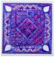
We will look at my design Infinity for this first comparison. I provided the students with hanks of Oliver Twist "One Offs" which contained a selection of cottons, rayons, linens and wools, all space-dyed in the same dye bath so that the colors blend.
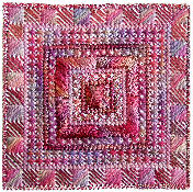
Anne (above) used shiny rayon threads for some areas to give a luxurious look to her work. She alternated the rayon with cotton fibers for the border of Scotch stitch. Although not entirely apparent in this photo, in real life the results of her thread choices were stunning.
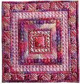
Alison picked a chunky thread for the wider cross stitch rows and a more delicate cotton for the paler Smyrna stitches. This has emphasized a distinct part of the design. I see a frame within a frame effect going on here.
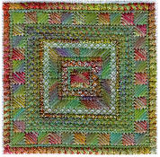
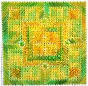
By changing the color scheme and the threads used, we get an entirely different appearance. Margaret chose green and autumnal colors for her work.
She has emphasized some borders with a metallic thread, which contrasts nicely with the matt fibers used elsewhere.
She worked the palest colored border in a fine cotton, changing the density of that area to make the center area stand out.
Tranquility
One highlight of the Textures to Dye for classes is when previous students bring in the work they did in an earlier workshop to compare with each other.
Even though they know they used the same pattern, their unique use of color and texture result in joy and excitement during this show and tell session.
The following pieces clearly illustrate the differences. All worked from my Tranquility design.

Here, the colours and fibers combine wonderfully. The shiny pink thread used for the slanted gobelin stitch makes that section stand out against the darker center. The darker, matt outside border (also slanted gobelin) frames the work.
Doesn't the version above look different?
The finished piece looks more like a traditional knot garden with flower beds in each corner, surrounded by pink brick pathways. The thin thread and paler tones make the rectangular areas stand out and the darker outlines bring them into focus.
The variegated pink tones used for the rhodes stitches in the center resemble multi-colored flowers.
Jean chose a different "palette" completely! The shiny golden tones contrasted with matt greens remind me of sheaves of wheat standing in a field surrounded by green hedges.
Hope
I stitched the purple piece below, while a customer stitched the cream and brown version.
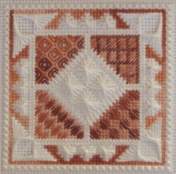
I picked my favorite color and a hank of Oliver Twist One Offs, whereas Erica chose a more monochromatic color scheme with a plain thread contrasting with a multi-colored one.
My version shows off the shiny thread used for the rhodes diamonds in the centre, while Erica's careful choice of color and the needlepoint fibres has highlighted the corners beyond the central diamond.
Over to you
I hope these examples have helped to show that your creativity and the choices you make can lift your work out of the ordinary and make it unique!
You might like these
Rice stitch - an easy needlepoint stitch to learn
Try Rice Stitch - one of the simple needlepoint stitches that you can use to give many different effects
Rhodes stitch instructions and variations
Learn how to stitch rhodes stitch and its variations. Photos and diagrams show how its done and what it looks like in various threads
Needlepoint: An introduction to the traditional craft
Explore the timeless art of needlepoint with our beginner's guide. From materials to techniques, we'll help you get started on your stitching journey.
Copyright © Carol Leather - 2006-2024
About Me - Contact Carol - Privacy Policy - Site Map - Testimonials
Please do not copy the content of this site. It is protected by Copyscape.